Learn how to use CSS and a few graphics to dress up images. Hopefully this article will inspire you and give you new techniques. This is a follow-up to my original article “Unique CSS Borders – Boring Borders Stop Aside” which you can see here.
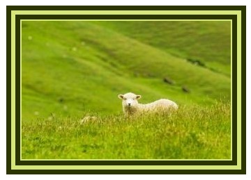
Double Border
This easy to create double border is so easy. This is a double border with a background color added. By adding 2 pixels of padding to the image you get a nice inner line which adds another dimension of design. You will get a different look depending on the browser used but the borders still look nice and your viewers will not know.
The CSS:
.double {
	border: 20px double #2B3500;
	background-color: #D6E67B;
	padding: 2px;
}
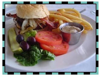
Art Deco
This is another very easy border. By using the border class: dash and a background color you get this very nice art deco design. I’ve also added 2 pixels of padding to the image in order to give a little more detail.
The CSS:
.art-deco {
	border: 7px dashed #73BFBA;
	padding: 2px;
	background-color: #000;
}
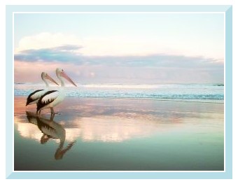
Two Tone
This is a bit reminiscent of the beveled edges of the early days. One suggestion that I have is to keep the border colors close so you don’t end up getting that retro look that makes us cringe.
The CSS:
.two-tone {
	border-top: #DBEEF2 10px solid;
	border-right: #B7DDE6 10px solid;
	border-bottom: #B7DDE6 10px solid;
	border-left: #DBEEF2 10px solid;
	padding: 2px;
}
Decorative X
By creating a graphic and using it as a background image, you can get a variety of unique looks.
For this example I created a graphic that is 10 x 10 pixel and applied a black background. I created the diagonal lines in gray to create an “X” like this.  By adding padding of 10 pixels (same as the graphic size) you get a nice effect. You can experiment with circles, triangles or bow tie shapes.

The CSS:
.x-back{
	padding: 10px;
	background-image: url(/web-design-articles/x.jpg);
	border: 1px solid #000;
}
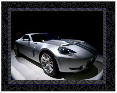
Nested Divs
This example uses two nested divs (inner and outer) to create a more interesting border. I found the background patterns at DinPattern. You’ll see that the inner and the outer divs both have an image as a repeating background and also a solid border. Be creative with background patterns or textures to make some really different looks.
The HTML:
<div class="outer">
<div class="inner">
<img src="car.jpg" width="382" height="303" alt="" />
</div> <!--end inner div -->
</div> <!--end outer div -->
The CSS:
.inner {
	width: 300px;
	padding: 10px;
	background-image: url(/web-design-articles/tread.gif);
	background-repeat: repeat;
	border: 1px solid #006;
}
.outer {
	padding: 20px;
	width: 330px;
	background-image: url(/web-design-articles/haunted.gif);
	background-repeat: repeat;
	border: 2px solid #666;
}
Have questions or ideas for other borders, post in the CSS Forum!
Nice code for individuals struggling with borders.
Over the past several years, computer science experts have become kind of a digital detective. Site Photoshopped Image Killer has developed computer algorithms that can tease out the tiny flaws hidden in phony photos. Though there’s no way to push a button and tell if a photo is real, there are tests run automatcally there to allow you to be pretty sure if it’s a fake.