All posts in Tutorials

Copywriting and Design Tips to Reduce Bounce Rate

In a way, website owners are worse off than people who pay millions of dollars for thirty seconds of airtime. That’s because they only have ten seconds in which to get their message across and impress viewers. People who fail at this have a high bounce rate—the number of people who leave their site after ten seconds. Bounce rate is important because it’s the most accurate measure of a website’s efficiency. Google now ranks websites according to bounce rate rather than simple hits, so that only the most relevant make it to the top.

Design and navigation play big roles in a site’s bounce rate, but it’s usually the writing that makes the difference. If people find your first two sentences useful, they read the rest. Others skim through an article and spot interesting phrases before deciding to stay. In any case, catchy writing is key to a low bounce rate, a decent ranking, and a steady readership.


1) Nailing the headline

Some people’s attention spans only last long enough to read the headline. In a way, we’re all guilty of this: we scan news websites for headlines and only read articles that catch our eye. A title like “How I Spent My Sunday” doesn’t really say much about what follows, but “Shark Diving in Cape Town” is clear, catchy, and makes readers want to know more.

2) Going straight

Beating around the bush is for novelists. Online, you want to put the climax and ending out there for everyone to see. Get straight to the point—if you’re selling shoes, come out and say you have the best ballet flats on the Web instead of going off on a long tangent about the effect of poorly made heels on metatarsal comfort (see #4). Your visitors came to your site to look at shoes, so why make them wait?

3) Writing with direction

I mean this quite literally. Web writing, especially if you’re after sales, has to point the reader to a specific direction, a “next step” of sorts. When you’re done describing your product or service, cap it off with something that tells them how and where to buy.

4) Keeping it simple

Unless you’re targeting a limited audience (such as your development economics class at university), stick to language that a fourth-grader can understand. This isn’t undermining your audience’s intellectual capacity; it’s just appealing to as many people as possible. A good article reads the way a person talks to a friend. Few people say “thereupon” and “notwithstanding” in casual conversation, so avoid them as much as possible.


5) Targeting keywords

Savvy Web searchers learn to weed out article farms where people spew out keyword-stuffed nonsense. Most users, however, just click on the title that seems most appropriate. So they end up on such websites, realize it’s not useful, and go back to the search page. If you write to attract people but not to make them stay, you’re not helping your bounce rate. Think like a reader: if you type “used books” into Google, you’re likely looking for cheap books, and that’s the kind of reader you should write for. They probably know what used books are and that they’re cheap, so a more specialized article, like where to find used books, will be much more popular.

About the author:

Sarah  is part of the team that
manages and maintains Australian Credit Cards, a personal finance blog about credit card debts based in Sydney, Australia. Before she joined ACC, she was an assistant editor-in-chief of Sandigan.

How to Write a Killer Sales Page

Writing an Effective Sales Page

There’s a big difference between getting traffic to your site and getting customers to actually purchase something from you. If you’re only going the ad route, using AdSense or Clickbank or any other type of site to earn some PPC revenue, then traffic is your main concern. But if you have products to sell, then you need to do a lot more than convince people to stop by.

Someone once said the pen is mightier than the sword. And while this person undoubtedly had never been stabbed by a hard piece of steel, he was still onto something – the power of the written word compels you! It really does.

However, many people attempting to sell products assume that the product speaks for itself and all they have to do is yell and scream and type in bold print with weird 64pt font and the sell is automatic. Not so fast, my friends. There’s an art to writing an effective sales page, and it has nothing to do with urging folks to buy your product.

You’ll hear that the so-called all-important “call to action” is a powerful tool that can sell ice to Eskimos, sand to camels and even online casino games to a blackjack site.

Okay, let’s see how well that works.

Buy this product now for $99.99!!!!!!!!!!!!!!!!!!!!!! It’s going fast!!!!!!!!! Everyone wants it!!!!!! They need it!!!!!!! You need it too!!!!!

Yeah, that’s an epic fail, especially when we’re talking about big red letters. But don’t get it twisted; the art of subtly doesn’t rightly work either. What it takes is clean grammar, assertiveness, a product that’s actually worth a customer’s money, and a strong pitch that shows off aspects of the product that will improve their lives.

The trick here is to start out telling a little bit of something about your product. Keep it all short, simple and clean. No big words, no long sentences, and no flamboyant punctuation or print. Just the facts, ma’am.

Next up, never list your sales price until the end of the page, where the “buy now” button or link will be located. Showing the price early makes people immediately think they don’t want to spend that much, and thus they probably won’t continue reading. But offering some concise literature about the product, some bullet-point positive attributes and some scenarios in which this product can help their lives will make the customer feel as if they need the product.

Also, don’t get carried away with the “slashed” price. Don’t put a picture up of a $500 graphic and sell your product for $39.99. Why is it so cheap? Can you not sell it for $500 if it’s worth $500?

Last but not least, stand by your product. Don’t simply espouse its virtues; offer a money-back guarantee and let it be known that you’re serious about its effectiveness from the onset.

If you can keep it clean, light, true to the product, and refrain from using any big-letter, big-slashing tactics, then you can write a great sales page that will lead to people clicking that PayPal button.

How to Create a Strong Web Presence with a One-Page Website

1

There are quite a few individuals, and even businesses, that wish they had the ability to create a simple website. Websites typically double as an informational resource and a connection to a particular topic or industry. People commonly refer to websites as a person’s or company’s “web presence”, referring to the fact that the subject of the site is known on the World Wide Web. We are here to tell you that creating a “web presence”, or website, doesn’t have to be a time or skill intensive task. Actually, we are going to show you how to create a one-page website that will get the job done in no time.

We are going to use the Wix.com website builder to build our one-page website for a variety of reasons: (1) It’s 100% free to create and publish a website, (2) the free website builder’s drag-and- drop tool makes the design process a breeze and (3) the builder offers users unique features, like Flash components, that can be added to any website. With this being said, let’s get started creating our new website.

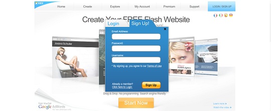
1.       Create a new user account at Wix.com. This is a simple task that will only require minimal information from you.

2.       Click the “Create” button, which is located on the navigation menu towards the top of the screen.

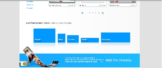
3.       You can choose one of thousands of pre-made templates, but because all of the templates are multiple page website, it is probably easiest to start from scratch. To start from scratch, scroll to the bottom of the “Create” page and select the size of your blank website.

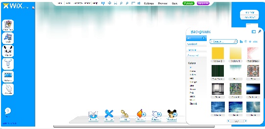
4.       The first thing you will need to add to your website is a background. Move your cursor over the “Page Parts” button, which is located at the top of the left navigation menu. You will then see another menu pop up and click on the “Background” button. Browse the background gallery and click on the one you like.

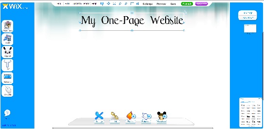
5.       Now you need a title. This can be the name of your company or even your name (if you are creating a personal portfolio). Move your cursor over the “Text” button on the main navigation menu and click on “Title”. Choose the format that you like. You will see the text pop up on your page. Select the text, press delete and type your own title. You can move the text box anywhere on the page by clicking and dragging it.

6.       From here, you can add any elements you wish to your website. A navigation bar is not needed because it is only a one-page website. To your own photo or photo of your business, move your cursor over the “Media” button on the navigation bar. Click on “Pics”. A box will pop up and will direct you to the pictures you have saved on your computer.

As we mentioned above, there are literally thousands of things that you can add to your new Wix website. Explore the navigation menu to see all the features that can be added. The opportunities are endless. When you are happy with the website you have created, click the “Publish” button at the top of the screen. You website will be instantly published on the internet at the domain that Wix has generated for you.

Viola! You have just created a custom web presence with a simple, one-page website!