Lately I’ve had a lot of requests from clients for photo galleries. I decided I needed to see what css options I could come up with to keep my galleries interesting which would allow each site to look unique. Here are a few examples that I came up with.
Simply Stated
This is possibly the simplest border but one that is high on style. This one pixel solid border has 5 pixels of padding and a background color.
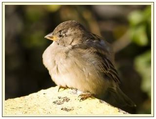
The CSS:
.plain {
	border: 1px solid #4C3C1B;
	padding: 5px;
	width: 300px;
	background-color: #EFEECB;
	}
Snapshot
If you wanted all of your images to look like Polaroid pictures, you could use this easy technique. By increasing the padding-bottom you get that “polaroid” look.

The CSS:
.snapshot {
	border: 1px solid #666666;
	padding: 10px 10px 60px 10px;
	}
Art Gallery
This technique gives each one of your images the appearance of being framed and placed in an art gallery.

The CSS:
.art {
	border-style: double;
	padding: 16px;
	background-color: #DCDCED;
	}
Above and Below
Place a double border above and below your photo for a cool look!

The CSS:
.ridge {
	border-top-width: 4px;
	border-bottom-width: 4px;
	border-top-style: double;
	border-bottom-style: double;
	border-top-color: #E1A60A;
	border-bottom-color: #E1A60A;
	padding: 8px 0px;
	}
Hearts
This isn’t supported in all browsers but it’s still fun! Using the border-style: dotted; and playing with the width of the image, you can get four hearts in each corner!

The CSS:
.hearts	 {
	border: 10px dotted #29C3FF;
	margin: 0;
	padding: 0;
	}
Patterned Background
Your options using a patterned background are limitless. This example also used a 1px border around the patterned background for a little more detailing.

The CSS:
.pattern {
	padding: 11px;
	background-image: url(/web-design-articles/squares.jpg);
	border: 1px solid #E95683;
	}
Shadow with Image
This is a similar technique as the one above using a background image. Instead of using a patterned background, I made a graphic of a shadow. To use this technique you have to know the size of your photo, create a rectangle a few pixels larger than your photo. In this example the photo is 300px wide by 199 pixels in height, I’ve created a rectangle that is 319px wide by 218 px in height. Soften the edges with your graphics software and save.
Here is the shadow image:

Add this to a div as a background and you get a pretty nice effect!

The CSS:
.shadow {
	background-image: url(/web-design-articles/shadow.jpg);
	padding: 9px;
	}
Off Balance
This example has a heavier border on the right and bottom plus a background color.

The CSS:
.right {
	width: 300px;
	padding: 0px 6px 6px 0px;
	background-color: #9FB2C1;
	border-top-width: 2px;
	border-right-width: 5px;
	border-bottom-width: 5px;
	border-left-width: 2px;
	border-style: solid;
	border-color: #082F70;
	}
Grunge
This example has a mask applied to a rectangle that I made in a graphics program.
Using the rectangle as a background image in the div creates a pretty interesting effect.
Here is the rectangle with the mask applied.

Here is the finished gallery example:

The CSS:
.grunge {
	background-image: url(/web-design-articles/laptop-graphic.jpg);
	padding: 26px 23px;
	width: 223px;
	}
Finally because this question still comes up often, I’ll show you a rounded corner border option!
Rounded Corners
There are several ways to do this example, but I will show you my favorite!
First start with a rounded corner graphic that you create in your graphics program.

Your next step is to slice it into three images.
Top

Center

Bottom

This method takes three divs. The html will look like this:
<div class="roundtop"></div> <div class="roundside">Place Your Image Here </div> <div class="roundbottom"></div>
The top and bottom div classes each have to have a width and height declared in order to see the background image.
The center div which I called “roundside” which holds the image will have “repeat-y” added.
Here is the completed result as well as css.

The CSS:
.roundtop {
	background-image: url(/web-design-articles/rounded-top.jpg);
	width: 315px;
	height: 10px;
	}
.roundside {
	background-image: url(/web-design-articles/rounded-sides.jpg);
	background-repeat: repeat-y;
	width: 315px;
	text-align: center;
}
.roundbottom {
	background-image: url(/web-design-articles/rounded-bottom.jpg);
	width: 315px;
	height: 10px;
}
Take some of these examples and expand upon them to create your own new css border design ideas!

beautiful author!
Above and Below – I would have liked to see how that looked with slightly wider bars – say, padding 8px all around.
Thanks a lot for this cool tips!
Thanks a lot for this article. Especially, I like the simplicity of your examples. “Shadow with Image” could of course be done in the way of “Rounded corners” and hence would be more independent of the picture’s size.
@Andreas S. So true!
@Ali Fuat You are welcome!!
@Bard K. I think I might do a follow up with more css border ideas! I’ll include your suggestion!
i`m kinda new to CSS ,you`re examples are beautifull..one question thou..
can i aply the class to the image src or only to the td where the picture is
Hey Sebastian!

Yes apply the class to the image source such as this:
Using tables isn’t recommended for web design unless you are placed tabulated data. If you have more questions, head over to the forum and we’ll be happy to help you further.
sorry ,but the link u gave me isn`t working..i also joined the forum ,maybe i`ll find there how to do it
wow nice images! Some of these are very very nice…
very nice css going include these for sure.
Great tips… I would like to see more in-depth usage of their concepts, but great overview coverage!
Hi Linda! Thanks for these elegant yet simple examples! Lots of ideas I wouldn’t have thought of on my own I made a site awhile back using the “polaroid” effect and I think it turned out nice
  http://www.dubefarms.com/ I also used the xsnazzy rounded corner method for my borders, so I suppose it could be used for a picture gallery too. The xsnazzy method can be found here: http://www.cssplay.co.uk/boxes/snazzy2.html
 Displays nicely in ie though (go figure!) Anyway, keep up the good work!
I think it’s a great way to make rounded corners using only code, although it takes a bit of a learning curve (for me anyway) and it doesn’t work in firefox
Wow..I really enjoy reading your tutorial. Very clear and straight forward. Thanks once again.
good post…
for rounded corners border(last one), instead of putting bg image for class “roundside“, we can give left and right borders, as thick as it is.
it will help u loading fast..
Thanks for the info that helps a bunch!
I noticed for the last example “Rounded Corners”, this does not work in IE 7, works fine in Firefox 3.0.6.
Any ideas on how to get it to work?
thanks
I saw a recent example of rounded corners done with a top and bottom image, then left & right CSS borders for the sides.
Not a solution for all designs but for simple examples like the one above it would work.
@pradist cd and @Dave I will add that to CSS Borders Part III so we have it here for a reference.
Thanks for that tip!
@ Derek, I tested the rounded corners in IE7 and it works for me. Try it again and see!
Thanks for the nice comments everyone!
Hi Linda!
Thank you for your time in putting together the above information.
I do have a question, if you take questions and give answers…
Say I’ve got an image of 160×160 and I want to use the first frame. The image is titled thumbnail1.jpg.
How would I make the first frame with your CSS code:
plain {
border: 1px solid #4C3C1B;
padding: 5px;
width: 300px;
background-color: #EFEECB;.}
work with that image?
or work with the “Above and Below” with your CSS code:
.ridge {
border-top-width: 4px;
border-bottom-width: 4px;
border-top-style: double;
border-bottom-style: double;
border-top-color: #E1A60A;
border-bottom-color: #E1A60A;
padding: 8px 0px;
}
I put the spaces in above like your example shows but the spaces aren’t showing in the preview, every line in both sets of code is lined up vertically to the left.
Thank you so much for your help! But, should I be posting this in the forums instead?
I’m going to sign up for your newsletter next.
Thank you again Linda for your time and for sharing your expertise!
Diane Dennis
Hi Diane,
We’d love to see you at the forum but I’m more than happy to help you here as well. You never know if someone else will come along with the same questions!
To apply the plain border to your picture is pretty easy.
The html code looks like this:
<img src=”thumbnail1.jpg” alt=”My Picture” width=”160″ height=”160″ class=”plain” />
The css has only one minor change and that is to the width.
.plain {
border: 1px solid #4C3C1B;
padding: 5px;
width: 160px;
background-color: #EFEECB;
}
For the second part of your question, the html will look like this:
<img src=”thumbnail1.jpg” alt=”My Picture” width=”160″ height=”160″ class=”ridge” />
The only part that changed is the class.
There isn’t any change to the css. It remains exactly the same. If you want to you can add a width to that css as well but it isn’t necessary in either example because we have given the image a width and a height of 160.
But if you wanted to make sure you had all the i’s dotted and t’s crossed you could state the width and the ridge class would look like:
.ridge {
border-top-width: 4px;
border-bottom-width: 4px;
border-top-style: double;
border-bottom-style: double;
border-top-color: #E1A60A;
border-bottom-color: #E1A60A;
padding: 8px 0px;
width: 160px;
}
Hope that helped!