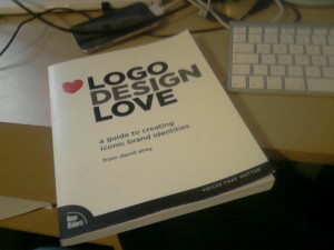
The book’s full title is “Logo Design Love: A Guide To Creating Iconic Brand Identities” and is published by New Riders. The idea for this book spawned from David’s website logodesignlove.com and also the popularity of his own blog davidairey.com and aims to share David’s own experiences in Logo design, how to design effective logos, how to deal and interact with clients and how to create your own iconic designs, plus a whole lot more
Disclaimer: I actually won a copy of this book via a competition on David’s blog, but I’ve not been asked to review it or received anything in return for reviewing it. What follows is my honest opinion on this book and nothing else.
Just in case you have not heard of David Airey, here is the bio published on the back of the book:
A self-employed graphic designer from Northern Ireland, David Airey writes two of the most popular graphic design blogs on the internet: www.davidairey.com and www.logodesignlove.com. David’s blogs have attracted hundreds of thousands of loyal fans who read and are inspired by his writing every day.
And you can also follow him on Twitter.

The book contains eleven chapters, split into three main sections which are:
- The Importance of Brand Identity
- The Process of Design
- Keep the Fires Burning
Additionally there is also a design resources section at the end.
Chapter One
The first chapter takes you through the importance of solid branding and obviously how crucial it is for the company’s logo to have the desired impression on potential customers. David then poses the question: How many logos do you see through out the day? Before then taking pictures of all the branding he sees in the first 33 minutes of his day – 33 in fact. Again this highlights the importance of the brand to any company, an ethos which is mentioned time and time again throughout the course of this book. The chapter ends by highlighting one of my favourite logos and one very well known one: The Food Writers Guild and a quote from its creator, Katie Morgan. This sets a trend in the book – throughout some of David’s favourite logos are highlighted, above all, this book is just a superb source of inspiration.

Davidson Locksmith logo by David Airey.
Chapter Two
Chapter two is titled “The Stories we Tell” and highlights logos that have a certain history behind them – the most obvious example being the Kellogg’s logo. Others are highlighted and the story behind their origin is told – again this serves as great inspiration but is very interesting. This chapter is one of the shorter and contains some very good information.
Chapter Three
Chapter three in my opinion is one of the best in the book and is titled “The Elements of Iconic Design”. Besides teaching the reader about these seven elements, each is coupled with some examples of some purely brilliant logos which really is fantastic. I should mention the book is printed in colour at this point – and I’m so glad it is. Black and white would not do some of these logos justice. The book is also brilliantly designed. After reading this chapter it’s clear that David really knows his stuff and some of the content is really superb. There’s a lot of “aha!” moments and some really killer stuff in there. Most of all, valuable tips that I’ll certainly be putting into practise.
Chapter Four
From here on the book moves into interacting with clients – chapter 4 covers the steps to take before designing the logo itself. The key message here seems to be to make full use of the brief the client gives you and then collecting a wealth of information from that client. David even lists the questions he asks and some information about the type of answers you want to get. You should also lay down some clear objectives. A lot of people (me included) tend to jump right into a new project – whether it be a logo or a new web app. This chapter brings you back down to earth almost and once more is a really worth while chapter. Even if you don’t necessarily do logo design, I’d suggest reading this one.

Henri Ehrhart Logo by David Airey
Chapter Five & Six
Chapter Five is all about redesigns and the hazards of them – including the infamous “Tropica” redesign. If you’ve been asked to redesign rather than starting from scratch you should step carefully. David explains what you should do that might differ from the usual steps and the different ways in which to go about redesign and common pitfalls, again valuable information. Chapter Six then moves onto pricing design – a highly debated topic and something I think everyone finds difficult as a freelancer of any profession, but especially in web design & development.
Chapter Seven & Eight
Chapter Seven is probably my favourite chapter in the book – although I think I might have already said that! This chapter is titled “Pencil to PDF” and discusses the process from initial ideas through to signing off the design and passing it onto the client, including mind mapping, which is something I think everyone could do. As usual the chapter is coupled with some superb illustrations and logos. Into chapter eight, and the subject moves on to interacting with clients, or “the art of the conversation” as David puts it. This is a pretty hefty chapter covering different ways of getting your point across, but also not being too pushy. David points out a logo in which a client’s favourite design for a logo he was doing was not the one he preferred – but he accepted that with hindsight it does suit the firm more. Many common issues made by both client and designer are covered here and David makes some points – I found that when you read them you realise that it is just common sense but often people do something without actually realising.

Vissumo logo by David Airey
Chapter Nine Through Eleven
After the eighth chapter you move into part 3 of the book, titled “Keep the fires burning”. Chapter nine covers the million dollar question – how to stay motivated, including lots of tips from not just David himself but also other logo designers. If I’m honest, there was nothing here that was particularly amazing, nothing that has not been said already, but still some valuable information. In Chapter ten David takes questions that he gets commonly asked on Twitter or via his blog and answers them, in a lot of detail. Questions range from copyright issues, to getting work, to dealing with problem clients and a whole lot more. I felt this chapter to be invaluable as it takes questions that multiple people have asked – many of which I would ask myself, and it’s great to see David taking the time to respond. Often things that might not make it into a book are brought up when doing this format for a chapter and it’s really worthwhile. Finally to end it off Chapter eleven is “25 Practical Logo Design Tips” which I found to essentially be a summary of the book and the key points to take away with you and having it at the end is a great reminder for some of those things you read earlier that might have slipped your mind. David ends with a small section with some design resources – mainly books that he would recommend. If “Logo Design Love” has wet your appetite, then there’s plenty more books to read having looked at this section!
Conclusion
To conclude I would absolutely recommend this book to anyone interested in designing brands, or to be honest anyone who works designing anything. Even if some parts are specifically towards logo design, as you would expect from a book titled “Logo Design Love”, there are lots of tips you can apply to web design as well, and the sections on dealing with clients are invaluable whatever the field. Head over to logodesignlovebook.com to order your copy now!
 Not all web hosting service providers are created equal, and that’s a fact. If you’ve ever been turned off by the complexity and confusion of a jumbled up user interface, been overcharged for domain names and hosting, or waited days for a support ticket to get answered that seemed to have been abandoned, then most likely, you’re with a crappy host service.