Spring 2010 Color Palette
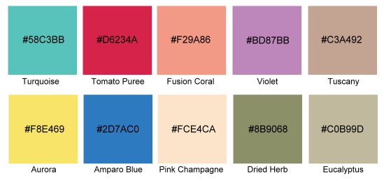
Start with one of these colors and visit one of our 25 Color Palette Generating Resources to select colors for your next design.
First up….
Turquoise
Turquoise is one of those great all-around colors that suit both men and women. Not too blue and not too green it’s complementary to so many colors such as orange, gray, and blue. This example shows how dramatic turquoise can be with black.
Tomato Puree
Tomato Puree is a red that leans in the direction of blue on the color wheel. It’s a cool red that adds drama without being hard on the eyes. Adding this color to black, white and gray as seen in the example gives the design a little wake up call. This color would be great as the primary color in a design as well. Pair it up with Aurora for some major WOW. Loving Eucalyptus but not sure what to pair it with? Try Tomato Puree!
Fusion Coral
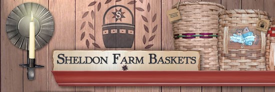
Honestly I didn’t think I’d be able to find a website that had Fusion Coral in it. Call me cynical or call me impatient but I didn’t think anyone would ever choose this color for their website. BUT…. I was wrong! This website uses only just a bit of it but I really like how it adds some extra flair to this other wise brown neutral palette. I think this color would be excellent for a latin-inspired designs as well as for sites geared towards women and babies.
Violet
This color takes big ..um…you know what’s to pull off! Take a look at that inspiration site and tell me you don’t love it! That color makes purple hip and trendy! Have a cutting edge service or product to offer and want to do something unique so you get noticed. Pick Violet! Mix it with black and gray like this site did or add some yellow and soft blue and you will get noticed!
Tuscanny
Tuscany is another great neutral and a nice backdrop for any design. A combination of brown and gray, this soft color is easy on the eyes. This could be used with different color palettes which include colors such as black, burnt orange, burgundy and chocolate brown. This color will offset all the really rich deep yummy colors.
Aurora
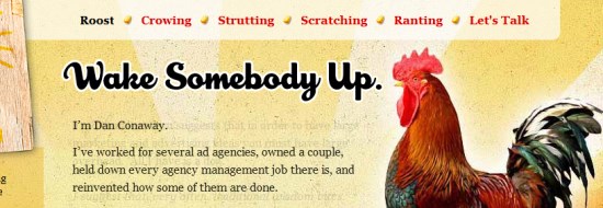
Aurora is a soft yellow that isn’t overpowering. I love this example because it’s used with a wide variety of colors. Aurora looks really nice with the red of the rooster and also surprisingly with the gray weathered wood. This color is just like a ray of sunshine… warm and pleasing.
Amparo Blue
Blue lovers keep this color in mind. This is the perfect blue because it’s not too “toddler primary blue” and not too pale. Want to generate a feeling of excitement and well-being, this color would do it. Mix it with anything from red, yellow, black, orange to soft shades like Pink Champagne. This blue is smooth!
Pink Champagne
Pink Champagne or this soft flesh tone would go with so many colors. As in this inspiration website, it really looks nice with deep mauve, dark brown and copper. Try it with forest green or navy blue also. This color is so pale, I think it needs some richness in order to be noticed. Personally I’m not feelin’ it! Are you?
Dried Herb
Dried Herb is an earthy green with a lot of gray in it. I can see this color being used in a couple of different ways. First it would be an accent color like the example above. I think it needs some vibrant colors mixed with it so that the design doesn’t end up being drab. I’d suggest colors like yellow, bright greens, orange and white. If you wanted a very earthy look, pair Dried Herb with colors such as soft browns, stone or Eucalyptus.
Eucalyptus
Eucalyptus is a neutral option. Instead of selecting gray or beige, try this color as your backdrop. It’s subtle hue is perfect for a design that will appeal to both men and women. I can’t even think of one color that wouldn’t go with Eucalyptus. This is a safe choice.






Thanks so much. I love these colours! And I love how you’ve shown the sample sites. Very inspiring.
Glad you liked it Julianne!
nice colors! I also don’t think there is any color of spring in the web world.. but the above colors look pretty cool!
The Tomato Puree one is very nice.
PS: I visited their site and I still have no idea what’s it about.
Some of your hex # are not correct. Can you please update them?
Ugh.. hate that! Fixed! Now the correct Hex numbers are showing.
I also don’t think there is any color of spring in the web world.. but the above colors look pretty cool!