Landing pages get a a bad rap. Designers often rebel against some of the basic principles of landing pages. And clients as well as agencies often misunderstand what a landing page really is and how to make it really sing. If you’re in the landing page business — as I am — you know that landing pages are really much more than they’re given credit for.
Debunk 1:
A Landing Page is a Page.
First, they’re far more than a page. The term landing page is a massive misnomer that devalues the rich hyper-specific landing experiences that are today’s most effective means of conversion. ‘Landing pages’ are actually groups of 3-25 pages of targeted content focused on a segment of traffic. These experiences may be classified as landing pages, land & jumps, microsites and conversion paths. I’ll define the types of landing experiences so we can all be on the same page (NPI) going forward:
Landing Page
The first page of any landing experience is its landing page. If you truly have a one-page landing experience designed to appeal and convert within the page, you can call it a landing page. Landing pages typically serve many masters as all appeals must exist on a single page. This ‘all things to all people’ approach typically results in lower conversion rates and poor design.
Land & Jump
A single-page landing experience that’s designed to warm the user up to something before it’s shown to them is of-ten called a land & jump (because they’re landing & jumping off to somewhere else for conversion). Land & jump experiences are sometimes called warming pages and are often employed in e-commerce to increase conversion, reduce cart abandonment, or increase average transaction value.
Microsite
A small, topic-specific website with specific, persistent navigation is usually referred to as a microsite. A microsite typically lives outside of the context of a brand’s main website and functions as a distraction-free deep dive into a relatively narrow topic. Conversion-focused microsite’s will feature a call to action on every page. They are likely to convert better than a landing page, but not as well as a conversion path.
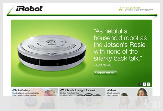
The home page of this household robot, topic-specific, conversion-focused microsite is clean and clutter free — only possible because the microsite exists outside the confines of the main website’s navigation.
Conversion Path
A series of pages designed to segment visitors into sub-groups and subsequently deliver segment-specific content and offer is a conversion path. These are multi-page experiences without navigation that guide visitors to make choices that help them get what they’re looking for. Conversion paths have a higher likelihood to convert because they typically only present the conversion hurdle to visitors in the context of very specific and personally compelling content.
I’ll offer some more guidance on how to decide which type of landing experience to use later in this article.
Debunk 2:
There’s a Landing Page Formula.
Landing pages are anything but formulaic. However, many in the industry oversimplify how to make them effective by focusing on button color, predictive eye tracking and other nefarious means that seldom track through to conversion. The fact is that different experiences work well in different contexts (just like everything in design). And good design is good design regardless of the means of delivery.
Debunk 3:
“Designed” Landing Pages Don’t Work.
Design often gets trampled in landing page circles. Poorly designed landing pages have led some in the industry to conclude that less design is better for conversion — translation: design is bad. Like everything else, bad design is bad — but good design is taking the heat because so little good design makes its way to landing pages. Hence this article and hence…
Landing Page Designers Call to Action
We need more good design in the landing page industry. The first online impressions a brand makes on its constituents come from landing pages. For designers or marketers to devalue those first impressions and allow them to be crafted by sub-par talent is disgraceful. Well designed, conversion-focused first impressions are money in the bank for brands and agencies. To ignore the potential of these pages is both irresponsible and damaging to the future valuation of design.
Good landing pages make money. As a designer, if you can directly make money for your client or employer, you’ll be a rock star. So let’s dive into how to design conversion-focused landing pages.
1. Choose Wisely
Set yourself up for success by choosing the right type of landing experience for the job. Does your need call for a landing page, a land & jump, a microsite or a conversion path? It all depends on two factors: the source & specificity of the traffic being driven and the nature of what you’re selling.
When to Choose a Landing Page:
If you have super-specific traffic choose a landing page. If you can fit everything you need to say and do in a simple, compact, easy-to-scan page, the landing page is your answer. Examples of good contexts could include links from house-list or other single-purpose, dedicated emails; simple calls to action from Twitter messages or blog posts; and low-hurdle conversions (name & email) for simple, high-value conversion bait (think ‘free subscription’).
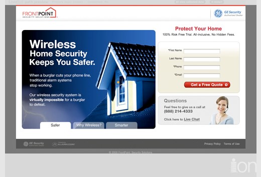
This landing page for FrontPoint Security is short, sweet and direct in its presentation. The tabbed graphic on the left is quick and painless without a page refresh or any load time. Note the clear call to action, high-contrast button , short & friendly form, and trust elements like the GE Security logo.
When to Choose a Land & Jump:
If the conversion will take place beyond the confines of your landing experience — for example in an ‘add to cart’ scenario — you probably need a land & jump. We’ve had enormous success using single land & jump pages between a campaign click (paid search, email or display) and e-store product pages. By simply reinventing those interstitial pages, we’ve been able to increase conversion rates, decrease cart abandonment and increase average transaction value. Think about making the visitor want the product more, helping them trust the brand more; or helping them understand the product’s application more.
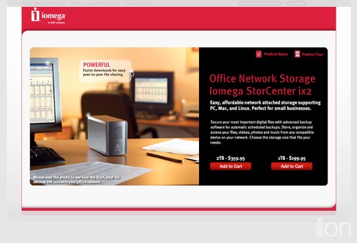
This land & jump for iomega simply presents product-specific content without clutter or distraction. Buyers simply choose between two sizes and add to cart. The conversion — in this case the purchase — takes place elsewhere.
When to Choose a Microsite:
If your topic is narrow, but your content is deep, you need a microsite. If your proposition is complex, your sales cycle is long, or your conversion value is very high (say anything in the thousands of dollars or more), you probably need a microsite. Microsites let you convey a lot of information while keeping each page short and sweet. A microsite may have a variety of messages on the one overarching topic — and each page is likely one message. In order for a microsite to be most effective, it should have a relatively clean stream of traffic that you know is interested in the microsite’s topic. If not, you’ll see a high bounce rate that you won’t be able to improve regardless of design or content.
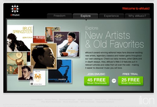
This microsite for emusic includes persistent navigation and clear, high-contrast calls-to-action on every page. This version uses two calls to action. It was tested against versions with a single CTA for either ‘join’ or ‘free trial’.
When to Choose a Conversion Path:
If your traffic is more vague — say from paid search where users are asked to act on 140 characters of information — you may need a conversion path to provide varied content to varied visitors without resorting to long, ill-converting pages. Display advertising is another good candidate for conversion paths — like paid search, the mes-sage is specific, but there can be wide variance in the interpretation due to vague or insufficient information.
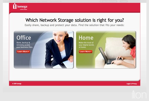
This conversion path for iomega segments visitors from paid search into home or office groups. Note the simplicity and clarity of the page and the way it presents the two options. It’s all about the visitors’ need.
2. Be Easy
First impressions have about a two-second lifespan. And visitors are willing to put forth approximately zero effort to figure out if your page is a good fit for them. No, they won’t scroll. And no, they don’t read. They scan and they do it fast. When they don’t see what they think they’re looking for, they bounce. If they bounce, they certainly don’t convert. And if they don’t convert, they don’t make your client money and you don’t look like a rock star.
Translation: If you make it hard for them, you won’t end up in a Ferrari. (You may not end up in a Ferrari anyway, but, if a Ferrari is your thing, it’s worth a shot.)
Reviewing a high-performance New England Journal of Medicine landing page with a five-point design checklist:
1. Does the page load in three-seconds or less? And yes, that means including Flash. Page load time not only affects your visitors, it affects the search engines’ quality score of your page as well. Google in particular will penalize your score big time — resulting in higher cost-per-click for your client and lower rankings. Not good. If you’re unsure over what size pipe to test your pages and how to judge if their speed is adequate, use Google webmaster tools or another benchmarking tool to get an idea of where you’re at.
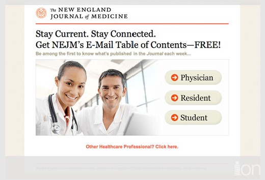
This is the first page of a conversion path. It loads a dynamically populated Flash SWF with all of the text rendered as HTML (and selectable). The result is fast, legible and search engine accessible.
2. Is everything important visible without scrolling (‘above the fold’)? Important is the important word here. It’s pretty hard to argue that your dominant visual, headline and call to action all need to be above the scroll line. But in some cases, I’ve seen bizarre things like trust elements — ‘privacy policy’ or third-party meatballs — affect conversion. So be careful of what you discard as unimportant. Remember, it’s not you that’s converting — it’s a visitor with very different sensibilities.

Everything important is high on this page, so that visitors can scan and get what they want with zero effort. There’s also a clear hierarchy and order to the design, making it comfortable for the eye to progress through the page.
3. Is your headline explicitly on message with the thing they clicked on to get to this page? Said another way, does the message of your ad’s call to action match the message of your page headline? This is about content as much as design. The tighter the visual and message relationship is between the ad that drove the user to your landing page and the page itself, the more effective your page will be. You can almost in-stantly judge this based on the bounce rate (and the time spent) on the first page of your landing experience. If your bounce rate is north of 60%, you have some sort of mismatch.
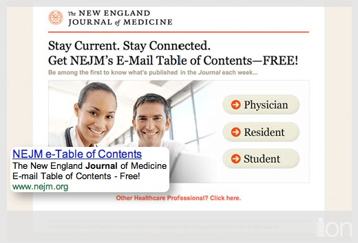
You should be able to see this kind of tight match between your ad (in this case, Google, paid search) and your landing page. If this was a display ad, you would also want the look & feel to match just as tightly.
4. Can you squint your eyes and still tell what to click on? This is all about the contrast and clickable appearance of your call to action or button(s). Unlike others who claim that button size, placement or particular color will always win the day, I can tell you from experience that the squint test is the surest form of evaluation. You need to design in editorial contrast. I personally prefer and have found it highly effective to make the actionable piece(s) of the page a color that isn’t used anywhere else. That one splash of contrast has proven to be quite attractive to visitors. (And I love to design that way.)
This page passes the squint test — although it would be even better if the segmentation alternatives were more differentiated from the rest of the content.
5. Is your text as clear and legible as it can be? Forcing a visitor to read small, low contrast text or long blocks of low-legibility display type is a sure path to the low-conversion rate blues. Drama is good for conversion. Trauma is not. The majority of highly successful landing pages don’t have that much text on them. And the text that is there is a minimum of 12px in size, with well-proportioned line spacing to make it easy to ingest. Now before you skewer me for relegating your landing pages to the typographical wasteland of Times and Arial, keep in mind that there are thousands of web fonts you can render as text. This lets you have the benefits of HTML text (search engine crawl friendly, fast load time) along with beautiful type. My personal favorite non-Flash, no plug-in, HTML+javascript font rendering technology is Cufon (http://wiki.github.com/sorccu/cufon/about).

The smallest text on this page is 12px (aside from fine print). Everything is legible and comfortable to read. Of course, like many high-conversion landing pages, there isn’t very much text to start with. Even though much of this example is rendered in Flash, the text is HTML and selectable.
3. Embrace Testing
Many designers are anti-testing. It’s understandable that asking thousands of visitors to vote (with their behavior) for a design’s effectiveness is disconcerting. But coming to terms with aligning your vision with the conversion function is akin to the role of industrial design in product development. Form and function must be aligned.
Designing for conversion is a commercial pursuit. Being good at conversion-focused design doesn’t mean you’re a bad designer. In fact, if you’re truly in alignment with your clients’ needs, your definition of good design should be conversion-focused. So for those of you that didn’t just give this page the finger, we can agree that the best design will be the one with the highest conversion rate. Testing takes a random group of visitors and give them alternatives. The landing experience alternative with the highest conversion rate, produces the most business and is hence the winner.
That doesn’t mean that the winner will be your favorite. Or the one you thought was most aesthetically pleasing. Or the most clever one. It simply means that the people you’re designing for, took the action you wanted them to take more often using the winning design. That’s not a bad thing. It may not be your criteria for judging the best design, but it’s not bad thing.
Conversion-focused designers accept that their work is judged by how well it performs. Those designers are rare. And they’re the future of a design profession under siege by non-designers who misidentify correlation as causation. Said another way, they ignorantly blame design when there are other, bigger issues in the mix.
You notice, I haven’t told you to make your buttons red, never make them green, or always place them in the upper-right quadrant of your page. And hopefully, you now understand why those ‘rules’ are misapplied in conversion-focused pages. I’ve seen winning pages increase conversion rates by literally thousands of percent. That’s dramatic, sometimes unbelievable, business benefit. Every one of those rock star pages has been well designed. Many have been aesthetically beautiful. And all have come from design professionals that embrace form+function+business value.

thanks Justin for these great landing page optimization tips.
You have mentioned predictive eye tracking, which is what we do at Feng-GUI
http://www.feng-gui.com
Feng-GUI empower web designers, advertisers and creatives to effectively analyze Attention and Attraction in visuals.
using Feng-GUI attention heatmap help you to identify weak and strong spots and increase your website conversion rate.
Wow, amazing article. Thanks for the insight. This shouldn’t be free.
The suggestion about intermediary pages in shopping carts to increase conversion is one I haven’t heard before. Interesting! I will check it out and how it might interface with zen cart eCommerce shopping cart. Would be awesome if there was a plugin for that!
Great article. So many people don’t think about this. I’ve just been reviewing banking sites and was amazed at how many got their ads and landing (land and jump) pages completely wrong!
Hi Justin,
Thanks for sharing this ideas… I’ve worked very close with clients that want form+function+business value, and a team focused on this mix is sometimes hard to pull together, but once you do it, everyone wins
My favorite part: “Being good at conversion-focused design doesn’t mean you’re a bad designer”
This goes to my toolbox. The debunks and the clear explanations spells the misconceptions designers have with respect to landing page.
This article serves as a foundation for landing page optimization, SEO, and conversion analysis. This is pure gold.
very nice. a treasure indeed.
Thank you everyone for reading. The positive reception is a great indicator that conversion-focused design is gaining steam online and gaining the respect of the design community. Cheers!
This is incredible, Justin, truly. Every paragraph I read gave me new ideas for my websites. I actually worked with single page landing pages all this time but this was a huge eye opener for why to use microsites – I can’t wait to get started with my redesign and see some results. I am 100% confident it will change things a lot for me. Thanks so much!
Great information! I’m a designer and have hated the idea that design and landing pages don’t go together. In addition to having good design, you also have to have intelligent design. You also have to keep your demographic in mind. And in some cases less design, or even bad design, may convert the highest. For example, we did a landing page that targeted a military/government demographic. After extensive testing we found that the poorly designed page, the one that looked like it was straight from the 90′s and matched the look of most government sites, converted significantly higher than the other designs. In that case, less and poor design intelligently won out.
Nice overview, its nice to see when to pick which page, although a management summary on top would do in my case. But nice overview to refer to.
Excellent article and very detailed. As a graphic/web designer, I constantly have to be explaining to my clients why they should go a certain route. I am definitely going to pass along this article.
This is one of the best articles I have ever read on landing pages. Thanks for sharing!
Tony
Great article. Need more like these!
Also, a friend and I just created a gallery for landing page design inspiration that the readers here would probably be interested in:
http://landing-page-gallery.com
If anyone has any well-designed landing pages they want to show off or a personal collection please send them in. Very hard to find good looking landing pages to add.
Thank you so much for this article! I definitely plan to reference and share it.
nice post
Great article. I think it’s safe to say most people who read it will come away with new things to try.
One question: Given that traditional Landing Pages are only one of the lesser-recommended strategies for handling incoming traffic, wouldn’t it be more appropriate to use a broader term such as “Landing Strategies”?
Martin,
Thanks for reading. Yes, a broader term is much needed in the space. I use ‘landing pages’ in this article because that’s an understandable and comfortable term for people. We’ve coined ‘post-click marketing’ to refer to the entire process of optimizing what comes after campaign clicks. And we often use ‘landing experiences’ to more broadly encompass all types of first impressions. I like getting the ‘experience’ piece in there to keep the focus on the visitor.
Cheers.
Excellent article. Thank you very much for sharing writing and sharing it with us. We have just been doing some Emailing campaigns and your article will really help me in designing the campaigns and creating the landing pages
[quote]“Can you squint your eyes and still tell what to click on?”[/quote] – Very useful too ^^
Regards,
Shailen.