What are “sprites”?
The dictionary defines a “sprite” as ‘A small or elusive supernatural being; an elf or pixie.’. It also defines it as ‘A small bitmap image, often used in animated games but also sometimes used as a synonym for icon.’. It’s this second definition that we’re talking about, so for the rest of this article, I won’t be mentioning elves!
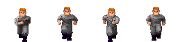
Sprites have been used in computer game graphics for many years to make animations smooth, and to reduce load times. All frames of an animation are included in a single image, called a sprite sheet, and only certain areas of the image are visible.
 |
Using this same principle of sprites with CSS, the idea is that you load in a single file with all your images/icons for a particular use. Then to use one of those images/icons, you simply set the stylesheet to reveal that portion of the image in the place you want it.
Think of it like this:
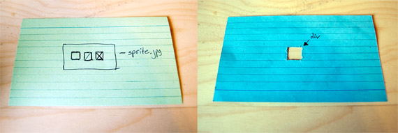
To illustrate just how sprites work, we’ll be using an extremely advanced piece of representational technology – cue cards!
In this example each cue card contains a page element, the green one has an image with 3 icons, and the blue one has a div tag. The div tag on the blue cue card has a transparent background, so a hole has been cut to simulate this.
Now, if we add our green cue card as a background-image to our div, we can see exactly how sprites work. Our div is only as big as one icon, so we can’t see the full image. However by changing the background-position of the image (in this case from left to right), we can control which one of the icons is visible inside the div.
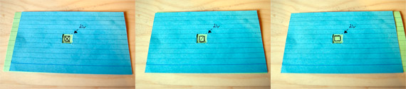
If you think of the page-load process as picking up an image cue card and placing it behind a div cue card, then rather than picking up 3 small cue cards, we’re simply picking up a single larger one.
Why do I need CSS Sprites?
Firstly, as illustrated above, by using CSS Sprites you will save a lot of time loading files. This is good, because it means less requests to the server, and also means no delay when switching images because they’re all already there.
If you’re familiar with jQuery or other mechanisms for javascript animation, you can also use the same principles as CSS Sprites to do simple transition animations.
Using sprites also means you can change entire icon themes by changing just one CSS file.
Who uses CSS Sprites?
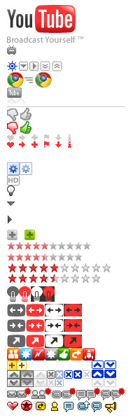
A lot of websites these days are using CSS sprites, in particular on icon sets and image based navigation. Most notably, YouTube uses a huge CSS Sprite Sheet for pretty much every image present on the entire site. You can see a small crop of this above, but the full image is much larger.

It’s particularly interesting to look at the star rating icons on the Sprite Sheet. The div which displays the star ratings on YouTube is as wide as 5 stars. When you hover over this menu, the background is simply moved from left to right to display either more empty stars or more filled stars, depending on where you place your cursor.
How do I use CSS Sprites?
Ok, getting down to the nitty gritty of how do you actually do this CSS Sprites stuff!
Effectively, the premise is that you have an element that matches the dimensions of your icons, you set your image file to be the background of this element, and you position it so that the desired icon is the visible one. Then for effects like a mouseover hover, you just change the background position so a different icon is visible.
So let’s try to replicate our cue cards example, but with real code and images! First of all I’ve created an image with our 3 icons in the same positions as they were on the cue card. You’ll notice that I haven’t left any blank space around the icons; this is to preserve file size with a smaller overall image, and also to make the maths a bit easier down the line. More on that in a moment!
Now let’s write the code, notice that each tag has 2 classes: its name, and “icon”. There’s no need to apply multiple identical styles to multiple different classes, when we can apply a single class to 3 different tags. You’ll see what I mean in a moment when we write the CSS, but for now let’s just create the 3 div tags which will hold our icons.
And now the CSS:
.icon {
float:left;
width:20px;
height:20px;
margin-right:10px
background:url(/web-design-articles/images/sprite.png);
}
.twitter {background-position:0 0}
.facebook {background-position:-20 0}
.tumblr {background-position:-40 0}
So let’s look at the “icon” class first: Because we know that each one of the individual icons is 20 pixels wide and tall, this is the size that we’re want to set the div to. If the div is bigger than this we’ll be able to see the other images on the Sprite Sheet, if it’s smaller, then we won’t be able to see the full icon. We want to lay these divs out with some space between them so we’ve floated them to the left and added some margin right. Finally we’ve specified that all divs using the class of “icon” will use the same background image.
These styles apply to all of our divs, so there’s no point in repeating them multiple times when we can just group them together into one class.
Now if we look at the CSS for the individual icons we can see that each class has only a single property: “background-position”. This property takes two values, the first is the distance from the left edge of the containing element (in this case a div), and the second is the distance from the top edge of the containing document. So a value of “0 0″ would position the image in the top left corner, and a value of “10px 20px” would position the image 10 pixels to the right, and 20 pixels down.
Our first background-position is “0 0″ because the twitter icon is at the very top left of the image. This is where using very little spacing in our image comes in handy again, because we know each icon is 20px wide, and there’s no space between them. We know that we have to move the background image exactly 20px to the left in order to display the next icon. Remember that the first value of the background-position property represents distance FROM the left, so in order to move our background image TO the left, we need to give it a negative value (in this case -20px). We then move the background image a further -20 pixels for the final icon, and here we are – 3 different divs, displaying different icons, but all using the same background image!
Adding Hover Functionality
That’s all well and good, but it’s pretty standard, so let’s add some hover effects! First of all we’ll add 3 new icons to our Sprite Sheet which are slightly brighter than the original ones:
In order to use the hover effect we need to set 3 new background positions for our divs when people hover over them so that the background is moved up, as well as left. Remember once again that the distances are from the top and the left edges, so in order to move the image up, we have to give it a negative value.
.twitter:hover {background-position:0 -20px}
.facebook:hover {background-position:-20px -20px}
.tumblr:hover {background-position:-40px -20px}
Here we go, the same icons, but now with added hover effects, all still using one background image!
We’ve used div tags in these examples for the sake of ease, but it’s worth noting that all these techniques would also work with anchor tags if you wanted the icons to be clickable links.
Wrapping Things Up
Now that you understand how CSS Sprites work, you can study other Sprite Sheets (like YouTube’s) to get an idea of other things which are possible, or you could even look into some basic javascript animation to fade in and out between different background positions. Either way, hopefully you’ve learned something new, and your websites will load quicker and use less bandwidth as a result!
Hey John, awesome article! I was always wondering how it’s done, but never really got into it, because I read some confusing articles about it. This seems really easy. I’ll be using this for sure!
Thanks
Good article — I especially like your “card with a hole” illustration.
Manual creation of sprites can be pretty tedious, especially when you’re trying to get the most efficient spriting possible. Several tools exist to automate the process; check out Steve Souders’s SpriteMe:
http://spriteme.org/
Nice article, I liked the “card with a hole” analogy as well.
Nice work!
Now I know what CSS Sprites is!!!
Thank you for explaining these well. You helped clear up all the fuzziness about sprites. I never knew you could combine classes in CSS. Fantastic!
I’ve never wanted to take the time to deal with sprites, but this article made it completely painless. And I have to agree with the other comments, the index card visual was perfect. Bookmarked.