Over the coming weeks (months depending on time), we will be releasing a series of tutorials on how to create a website in WordPress starting from the very beginning: the design phase in Photoshop. This first part will show you how to create a grunge-style blog in Adobe Photoshop. Then a second part will follow that will show you how to slice the site in HTML/CSS. The third and final part will show you how to implement that code in WordPress.
Let’s begin this series with Part I – Design.

Laying out the grunge
Open up Photoshop and create a new document 1000px X 1300px. This is just to make sure we have ample space for a 920px wide site if we wish. It is very important to remember that Photoshop is just a tool like the Pen & Paper. Width can be changed once we start Part II which is the coding part.
Once that’s open, change the background to #ded6a9
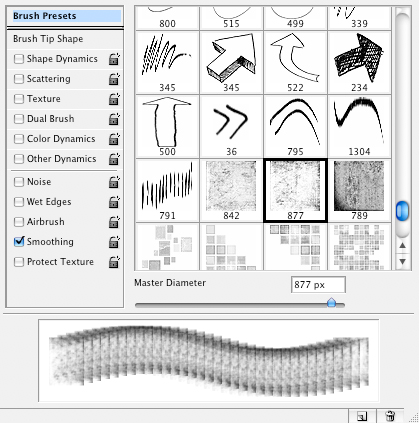
Using the Heavy Scratches brushes from myPhotoshopBrushes.com, create a new layer and take the 2nd brush, change the width of the brush to 1400px and apply it to this new layer. Change the opacity to 7%.
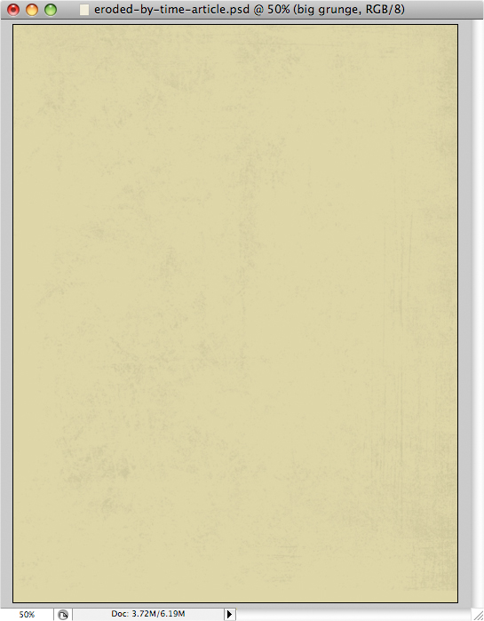
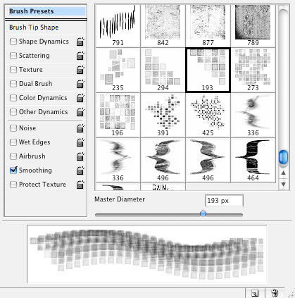
Looking good! But we need more grunge stuff. Grab the Squares and Brackets brushes and let’s add some more. Create 3 new layers and apply 3 brushe. Set the opacity to different levels to get a better effect. This part is really up to you and how you want it to look. Here’s what I did.
In the first layer, I used this brush and set the opacity to 8%
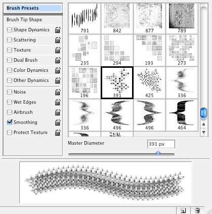
In the second layer, I used this one with opacity 11%
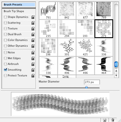
And the last one, this brush was used and the opacity of the layer is set to 21%
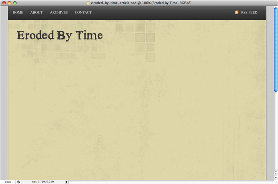
The result should be something like this

Creating the header
Next, lets create a navigation bar at the very top that will contain important pages/links such as: Home, About, Archives, Contact and RSS. Use the rectangle tool and create a rectangle 1000 x 55 and place it in the top left corner (0, 0). Apply a gradient overlay with the colors #2c2c2c and #5e5e5e and change the position of the color midpoint to 70%.

Then add the text HOME, ABOUT, ARCHIVES and CONTACT on the left hand side and RSS FEED on the right. To make the RSS link stand out more, I went to pinvoke and downloaded their fugue icons which look really great. Open up the feed.png icon and place it next to the RSS link.

For the title, I went to DaFont.com and downloaded the Times New Yorker font. A great grunge font with style that adds character to our design. The color used is #363636 at 48px.
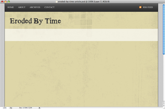
Now on to a secondary navigation that will contain links to categories. Create a new layer and under the title make a selection 1000×80 and fill it with white (#ffffff). Then change the opacity of that layer to 65%. You should get something like this:
Now on to the fun part. Duplicate the layer you just created so you have a spare copy in case what you do next doesn’t look good so you can just start over. Hide the original and work on this duplicate layer. Grab the eraser tool and use this spatter brush…

… and start “erasing” parts of the box. Try not to go too close to the side edges so that when we cut this up for the XHTML, it will repeat smoothly. Remember that there is no right or wrong here so just have fun with this. Here’s what mine looks like.
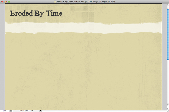
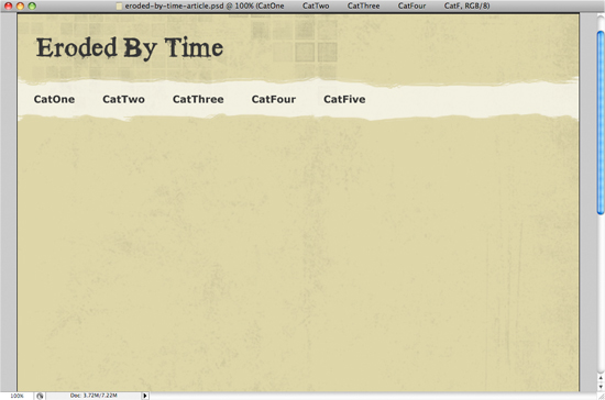
Add some dummy text categories using the Verdana font set at 18px with the #363636 color.
On with the content
So now the header section is done. It’s looking great isn’t it? Let’s keep it up! Now we’ll go and get the content section ready. We’ll be creating a 2 column layout so one big column for the actual content and a smaller one as a sidebar.
Let’s start with the content. Create a new layer and make a selection 650px X 900px and fill it with this nice beige – #f4f1e2. Then add a 1px border on the inside with the color #b4b2aa.

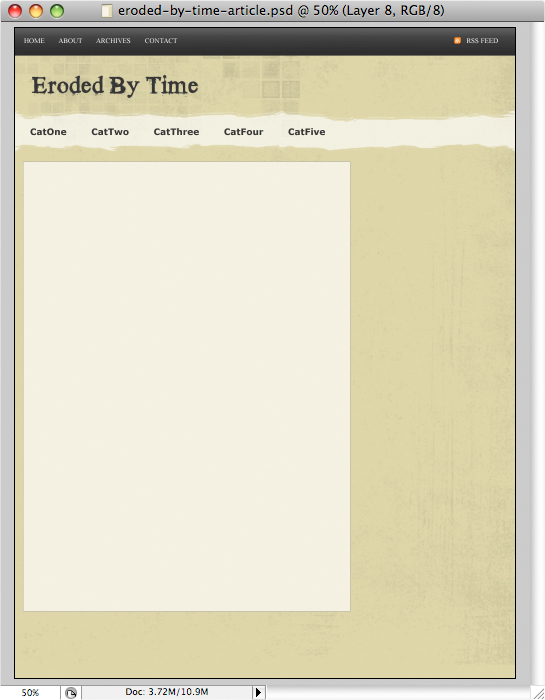
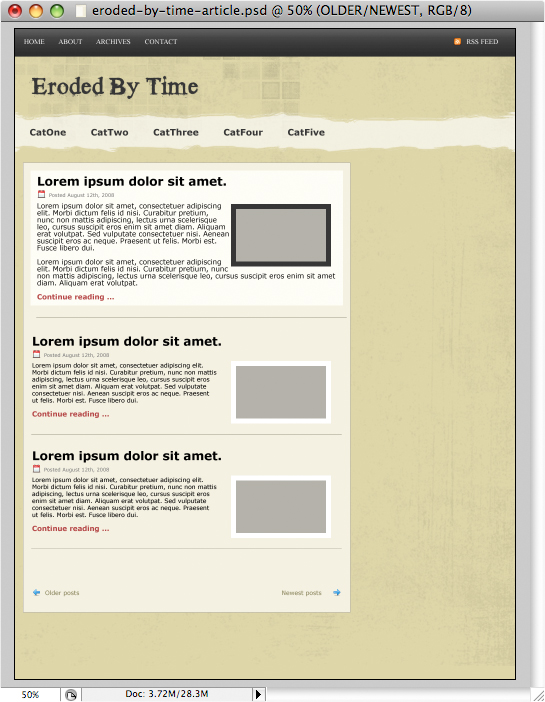
Now we can add some dummy content with Lipsum text. All text will have text size of 12px. Titles will be 24px and the Continue Reading link will be 14px with color #b54646. The date is set to 10px with color #777777. To make the new entry in evidence we will put a white background and the content in 14px. The rest will remain the same.

The calendar image I took from the fugue icons from pinvoke. All the icons in the design will come from there so keep them handy.
Now at the bottom of those posts we’ll add some “previous” and “next” text to navigate between archives. Something simple, so let’s put Previous on the left and Next on the right and both with a nice arrow from the fugue set. Let’s use font size of 12px and color #89835a.
A sidebar
Our sidebar will have a series of boxes for the tags, popular posts and latest comments. We will also have ad space at the top. So let’s get cracking.
Creating the ad boxes is fairly simple. We’ll go with 145 x 145 boxes which is usually a pretty standard size. So create a 145×145 square using the rectangle tool (U). Fill it with #cbc189 color and add a 1px border on the inside with the color #a4974d. That will also be the color of the text we will use. Duplicate it 3 times so you have 4 boxes and put them 2 x 2 like so.
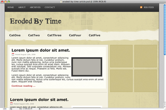
We then add some text “Advertising 145×145″ on 2 lines. Font size 12px with color #948532.

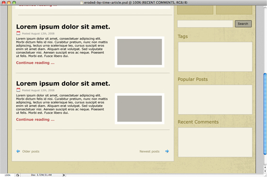
Next we add our Search feature. Using the rectangle tool again, create a box that’s 225px X 30px. Make it the same color and border as our big content box so: content color #f4f1e2, border color #b4b2aa. As for the button, since we will be using the browsers default button when creating the page in HTML, just use the rounded rectangle tool with any background color.

Next we’ll add our Tags, Popular Posts and Recent Comments boxes and titles. Since the content in those boxes will be dynamic (meaning long titles, short titles, etc…) we’ll make them all the same size for now just so we can get an idea of what it will look like. Our titles will have a font size of 18px and color #776a23. Our boxes will use the same background and border effect as the search box. Let’s make the boxes all 300px X 120px and we’ll fit content in accordingly.
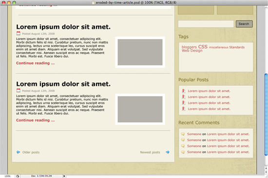
We’ll go in those boxes now and add some dummy text. As bullets for the Popular posts, we’ll go back to the fugue icons from pinvoke and use the bookmark_document.png. And for the Recent Comments, let’s go with ballon.png. All our links throughtout the future site will be in red (#b54646), so we’ll do that in the sidebar as well.
Finishing off with the footer
For the footer, we will use the same technique as with the secondary navigation above meaning that we will be scrubbing off the background to make it nice and grungy.
Let’s start off by creating a new layer. Using the marquee tool (m), create a rectangle at about 1220px all the way to the bottom right corner of your canvas. Fill it with black and change the opacity of that layer to 15%. You should have something like this:
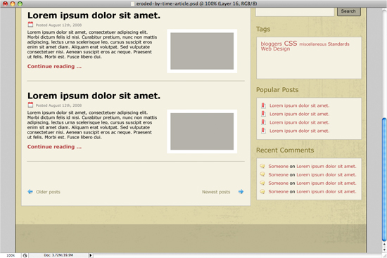
Now grab your eraser and start erasing the top edge. Remember to make a duplicate just in case and do not go too close to the sides so we can cut it up nicely later. Here’s what I came up with:
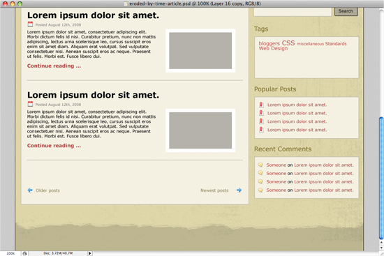
All that’s left to do now, is simply add a bottom navigation as well as copyright info.
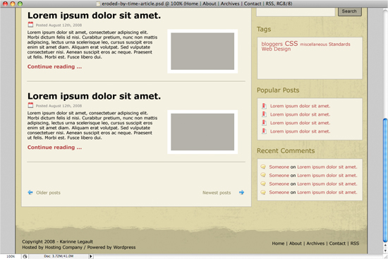
And that’s it! Next up in this series, we’ll take this same design and turn it into a functional HTML/CSS page. Click to read Part 2!

nice tutorial
thanks mate
Looking forward to following this. Thanks!
Great article K, looking forward to the next one
@Markus – You’re welcome! Thanks for checking it out!
@Josh A. and @Craig – Thank you! Hopefully, I’ll be able to do Part II in a week or 2.
I wish you had done this about 2 months ago, because I learnt myself the hard way.
Look forward to the next read
Thanks a lot, this is just what I was looking for, cant wait to read the next 2 parts!
I am also following!
As usual there is something I am not sure about. At the point where you say, ‘Now we can add some dummy content’ unless I missed it, there is no explanation on how the right side boxes are done and how the text is wrapped at this point?
Thanks Karinne
@Jacob.R – It’s actually in the paragraph before that one. The one that starts with “Next we’ll add our Tags, Popular Posts and Recent Comments boxes and titles.” The last two phrases of that paragraph explain the boxes: “Our boxes will use the same background and border effect as the search box. Let’s make the boxes all 300px X 120px and we’ll fit content in accordingly.” Let me know if you have any more questions.
Great tutorial! I am looking forward to the next couple of parts, especially turning it into a WordPress template.
@areisdesigns – Thank you!
Great article, hardly waiting the 2nd part.
Wow! Thanks for this! I’m anxiously awaiting the part where you explain how to make your design usable with wordpress… I’m able to take someone elses template and modify it, but I would LOVE to know how to do it with my own designs. This will open many doors
Eagerly awaiting the next parts!!!
Thanks Karinne! Great Tutorial
Although its now January and still no part II no fair!!
Cannot wait for you to publish it.
@all – Part II should be coming by the end of this month or early next month.
Thanks… need part 2!
I’m waiting for part 2 i need to learn with it.. lol thanks for really nice toturial.
Looks great! I am eagerly awaiting part 2…
I’m waiting for part 2. Thanks.
Hey Karinne,
Any plans for part 2?