The ten hot colors for Spring 2009 are here. Not too surprising they are lighter in color with a tendency towards pastels. Sometimes selecting just the right shade can be a difficult task. However, the color experts have done the hard work for us.
If some of these colors make you cringe at first site, that’s ok. Some of colors left me feeling as if designing with them would be an impossible task. However I was able to find inspiration sites with all the trendy colors and they are gorgeous. So here’s to a fresh perspective for designing for Spring 2009!

Fuchsia Red
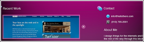
Fuchsia Red is one of those colors that scares a lot of designers. This is one of those colors I bet made a lot of you cringe! We often think it’s too feminine or just not professional enough. Here is an excellent example of Fuchsia Red and the drama it can bring to a design. With the addition of some dramatic blues this Fuchsia Red site is gorgeous. If your goal is to show how creative you are, this color really speaks volumes. You will get noticed.
This inspiration site was provided by Savagemic
Salmon Rose
Wow what a color! Fun, fresh, unexpected. It takes a confident business to agree to a website with this color. Why not though! Want to be remembered? This will do it. There is nothing baby girl pink about this. I love how this designer put Salmon Rose with black. So simple but so effective. For fun, fashion or flair, this is a great color.

Palace Blue
This is and always will be a color that designer’s will always have ready at hand. It doesn’t matter what type of business, or who the target market is, this blue is safe, pleasing, and dramatic. Perfectly unisex and suitable for business that are funky or formal. This color is perfect as a foundation for any palette.
Another great inspiration site provided by Savagemic.

Lucite Green
Lucite green is such a beautiful blue/green shade. Similar colors have been seen everywhere for years. So this is a nice option for a fresher blue green color. I think this color is excellent for any type of website since it emits such positive vibes.

Super Lemon
Want to make a statement? Super Lemon packs a power punch! This color is excellent for creating excitement and urgency. Used as the predominant color, your design will demand attention. If this color scares you, use Super Lemon for navigations, headlines, call-to-action buttons and other elements you wish to emphasize.

Dark Citron
This green is a very sophisticated shade. If your next project has anything to do with nature, fresh produce, health and well-being, consider using this very calming green.
Lavender
Lavender is the ultimate soft pastel. Perfect for sites that need a soft, serene feeling. This shade could also be used as a neutral instead of your typical gray. Experiment a little because this color is hot right now.
This inspiration site is by one of our members,Christopher Powell. Follow him!

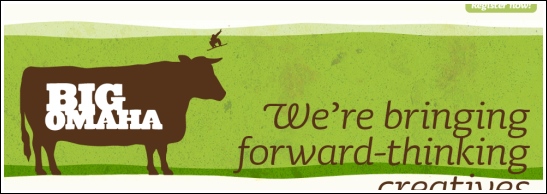
Vibrant Green
What a gorgeous fresh green! This is perfectly suitable for both men and woman and for all types of businesses. I think it’s a nice change of pace from the more often used blues. I think this is one to seriously consider for a new project.

Slate Gray
Slate gray is probably the most neutral shade of the season. Instead of going gray this season, try incorporating this color in your designs. Paired with any of the pastels, or with jewel tones such as burgundy, navy or even black, this color is a winner.

Rose Dust
Pink with gray undertones make this a nice usable color for many people. With the added gray it takes you away from the baby years and gives a bit more sophistication. Rose Dust is one of those easy to use pinks that blends so nicely with gray, burgundy and greens. Create a soothing mood with this color.

I hope you’ve been inspired to try one of these new HOT colors! If you do use one, leave us a comment with a link to your site!
Thanks for featuring my work here. It is an honor to be included with these excellent works.
Sweet double feature! Thanks Linda! Great article!
Great article Linda! I have a client that I’ll be going with a “Slate Grey” type of color.
@Michael Savage – I can’t wait to see that fushia site live! It looks great!
Is nice! Great article.
I wonder about the relevance of this but some people seem to like it.
wow, the fuchsia red is so nice and different. love it!
@Karinne – I had mixed feelings about it but I’m glad people like it! I’m going to put it up for a free download I shoot to have it done in a week or so.
Great post dude.
Interesting idea for a post, really liked it!
It seems like most new sites that I have seen use a nice bright bold color, like the ones shown above, but they off set it with a very neutral earth tone color.
I have enjoyed these combination on sites.
Thanks for the add! There’s some sweet stuff on this site!
Not sure about the Fuchsia Red maybe needs to be more the purple side, but do like the slate gray( that seems a bit on the green side! )
Red is such a potent colour online (as your examples above illustrate well) it’s crazy that some people are reluctant to accept it’s sensible use.
Great article and site examples!
Great article Linda! The vibrant green of the Tic a Tac poker game for the iPhone’s is amazingly lush! Thankyou.
Glad you like the article everyone. I don’t think we follow trends in web design like the furniture or fashion industries, but I find it’s a nice source of inspiration. Will be following up with Fall 2009 soon!
I loved Vibrant Green
Great selection of Websites, some really nice colours! I’m currently working on a new website. You really helped me out here. thx
urgh salmon :/