We all know that the success of a website is greatly influenced by the core idea, how it is built, the technologies behind it and the user interface but there’s one thing you should never overlook: the color scheme. Simply put, the right color scheme can make or break your project.
Even if you have the greatest idea and you have all the skills necessary to make your project a reality, if you greet your visitors with a dull or inappropriate color scheme for the audience, chances are they won’t return to your site.
Understanding The Basics
Of course the colors you decide to use is a personal choice, but here are some pointers. See those as a starting point. Like with everything else, it is ok to experiment and sometimes break out of the mold.
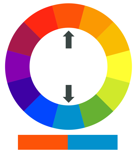
Let’s start with the color wheel:
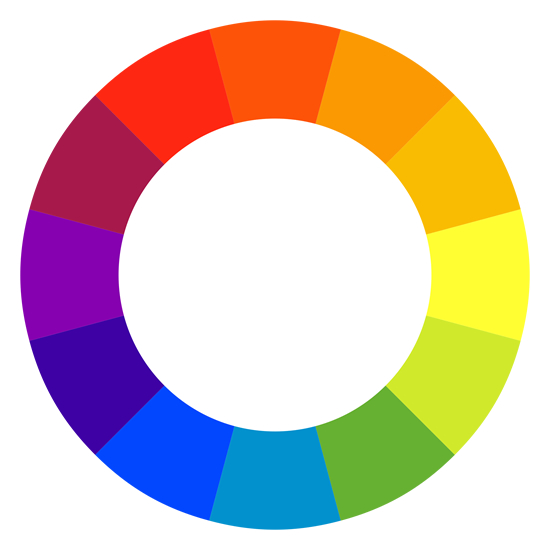
There different types of color schemes such as monochromatic, analogous, complementary, triadic and neutral. Here’s a quick explanation of each of those different types:
Monochromatic: Different shades of a single color. It depends on how much black or white is added.
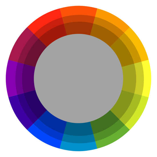
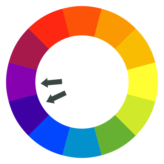
Analogous: Colors are close to each other on the color wheel. (blue and purple for example)
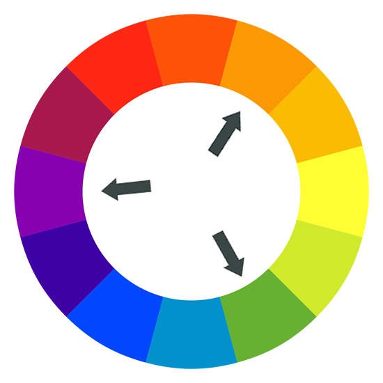
Triadic: These colors are spaced evenly on the color wheel. For example you could have shades of green, red and blue. As the name implies, triadic comes from ‘triangle’.
Complementary: This is often seen as “opposite” because the two colors in a complementary color scheme are opposite one another on the color wheel. (blue and orange for example) Many people will like to go with a complementary color scheme since it is easier to combine two colors than it is combining 3 or 4.
Neutral: A neutral color scheme includes colors that are not in the color wheel. For example: beige, brown, white, black, greys, etc.

Choosing The Right Color Scheme For Your Audience And Niche
The color scheme you chose will probably be greatly influenced by your audience but it also depends on what meaning and emotions you want your website to be associated with. The meaning of certain colors will also vary depending on the country and culture. For example, the color red usually means passion and leadership for North American people, but it can mean mourning and grief in South Africa.
- White: pure, neutral, clean
- Black: classy, elegance, power, mystery
- Grey: humility, pessimism, balance, formality
- Red: passion, fire, strength, leadership, love
- Green: environment, wealth, youth, greed, creative
- Blue: peace, harmony, conservative, cold
- Purple: royalty, envy, spirituality, pride
- Orange: enthusiasm, energy, happiness
- Yellow: gold, joy, optimism, weakness, light
- Brown/Beige: Earth, natural, friendliness, rustic
- Pink: love, gratitude, health, joy, young
Needless to say you should do a lot of research before deciding on the color scheme you will use. Make sure you research existing websites in your niche but don’t forgot that sometimes thinking a little outside the box can be a good thing.
Color Contrast
Once you have a better idea of the range of colors you’d like to use, it’s crucial to understand how important contrast is. Take a look at the following examples:
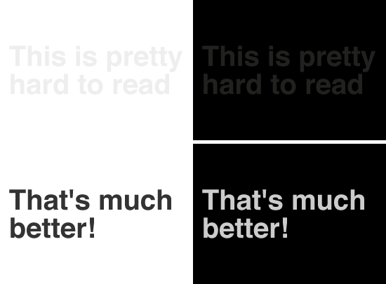
As you can see, the text in the examples above is not very readable. For some of you it may look ok, but for some people with color blindness or impaired vision it may be completely impossible to read. Also keep in mind the age of your users. 16 year-olds usually have better vision than people over 50.
Clashing Colors
Back in the Geocities days, a royal blue background with red and yellow text was very common (1998 anyone?). But these days designers need to pay attention to colors that may clash. See the example below:
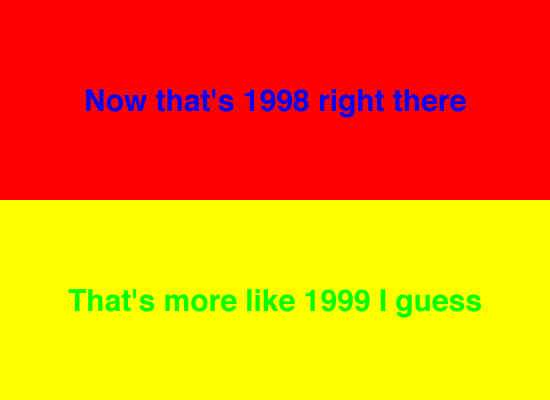
Not good! Now check out the examples below:

Much better, right? ![]()
How To Chose A Color Scheme From A Photograph
Sometimes you’ll want to create your own color scheme based on photographs that will appear on your website. Let’s pretend I’m building a website about Siamese fighting fish. Here’s a picture I took from my own Flickr account. At first I see 3 main colors: green, blue and brown.
That’s a good start. Now let’s open up that picture in Photoshop.

What you can do is take a sample of the image. You can take your sample horizontally (or vertically if you prefer that) like this:

The sample I took is 1px hight and 550px wide. Of course I reduced the size of the image considerably, no need to do this step with a 4000px wide image.
And then, I simply stretched that selection vertically and got something like this:

The results you’ll get will vary but by experimenting a little you should be able to come up with some amazing color schemes.
Online Tools
There’s a lot of web-based tools to help you chose the right color scheme, here are some of my favorites:
Colour Lovers
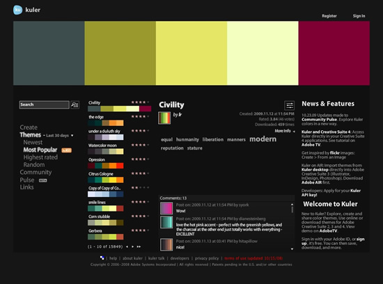
Adobe Kuler
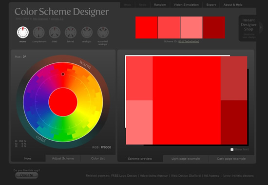
Color Scheme Designer
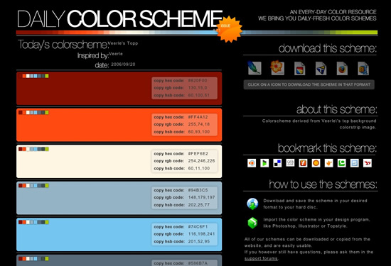
Daily Color Scheme
Your Turn Now!
I hope you enjoyed this post! Please share your own tips and tricks with the rest of us ![]()


That photo thing is a VERY neat trick – can’t believe I haven’t come across that one before
To add to your resources there’s also a really great iPhone app for colour pallet building with an accompanying online community – it’s called MyPantone, and is made by the Gods of colour, Pantone themselves!
Very nice.
Here’s a neat little online tool to play around with the colour wheel – http://www.colorsontheweb.com/colorwizard.asp
Informative and colorful article. Enjoy reading them, thanks man.
thanks for really helpful tips and tools.
Wonderful article and resources. Ping’ed. Thanks!
very very intresting and useful thanks a lot…….
Clear and well explained nice lay-out as well…
I know these basics. I studied them in my fine arts studies during my college. Making colour schemes is fun and interesting. Colours also tell about your personality. You can judge what kind of person one is after seeing his colour patterns. I really enjoyed my course and got exited to see this post telling what I have learned many yaers ago.
Cheers